
BENSON PROPERTY
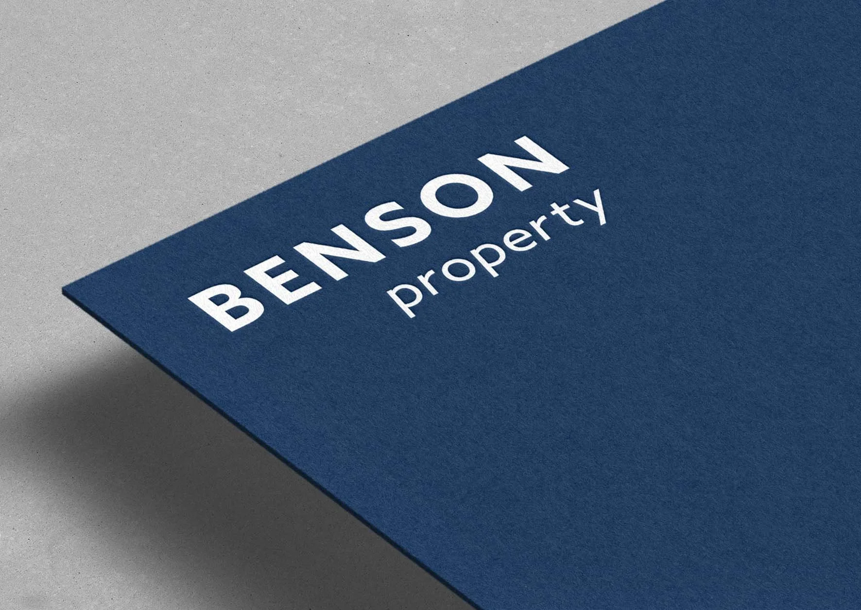
A clean and modern brand refresh for Benson Property. We retained key elements of the existing brand while pairing them with a contemporary font to create a fresh, professional identity.
To personalise the brand, we also introduced a pink version, reflecting Pat’s favourite colour, adding warmth and approachability while maintaining a cohesive, polished look. The refreshed identity ensures consistency across all touchpoints, presenting Benson Property as professional, approachable, and modern.
PROJECT SCOPE
-
Retained legacy brand elements for continuity
Modern font selection for a fresh, professional look
Alternate pink version for personalised branding
Colour palette and typography guidance
Brand guidelines