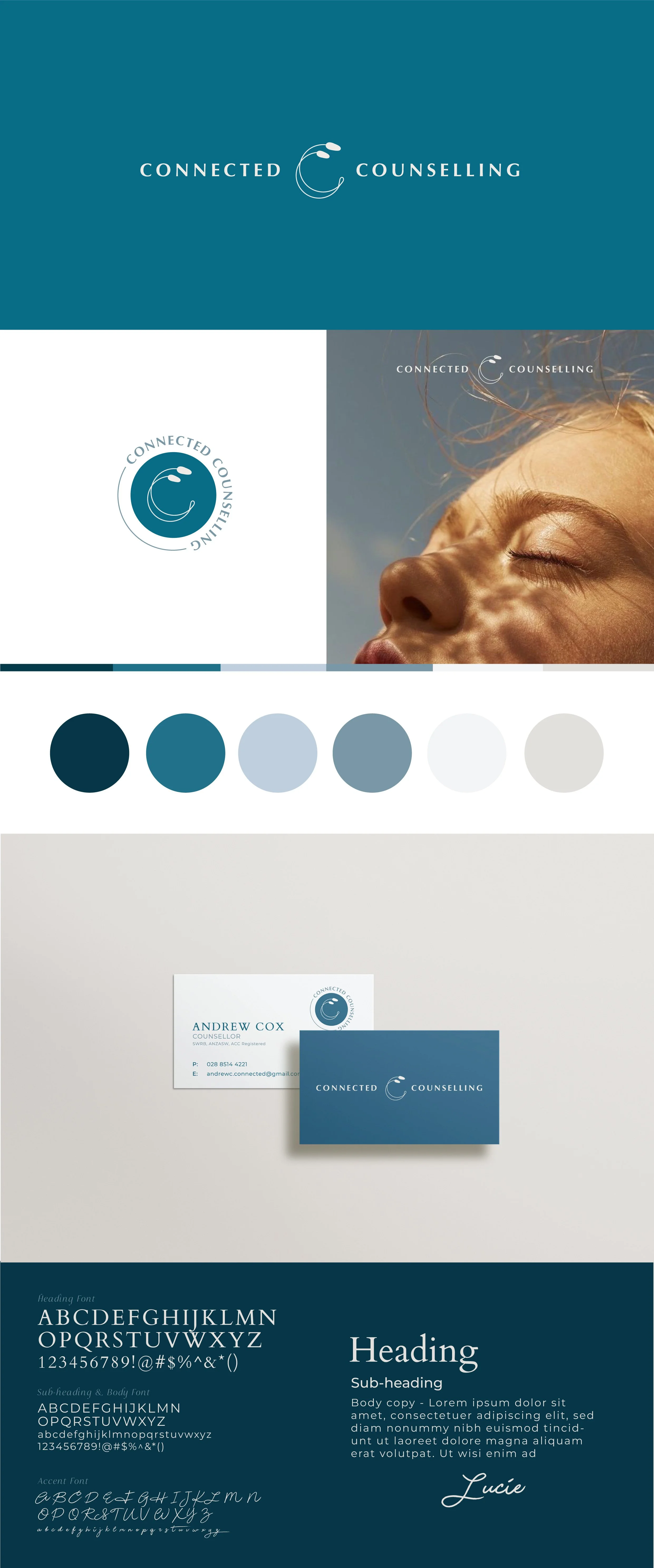
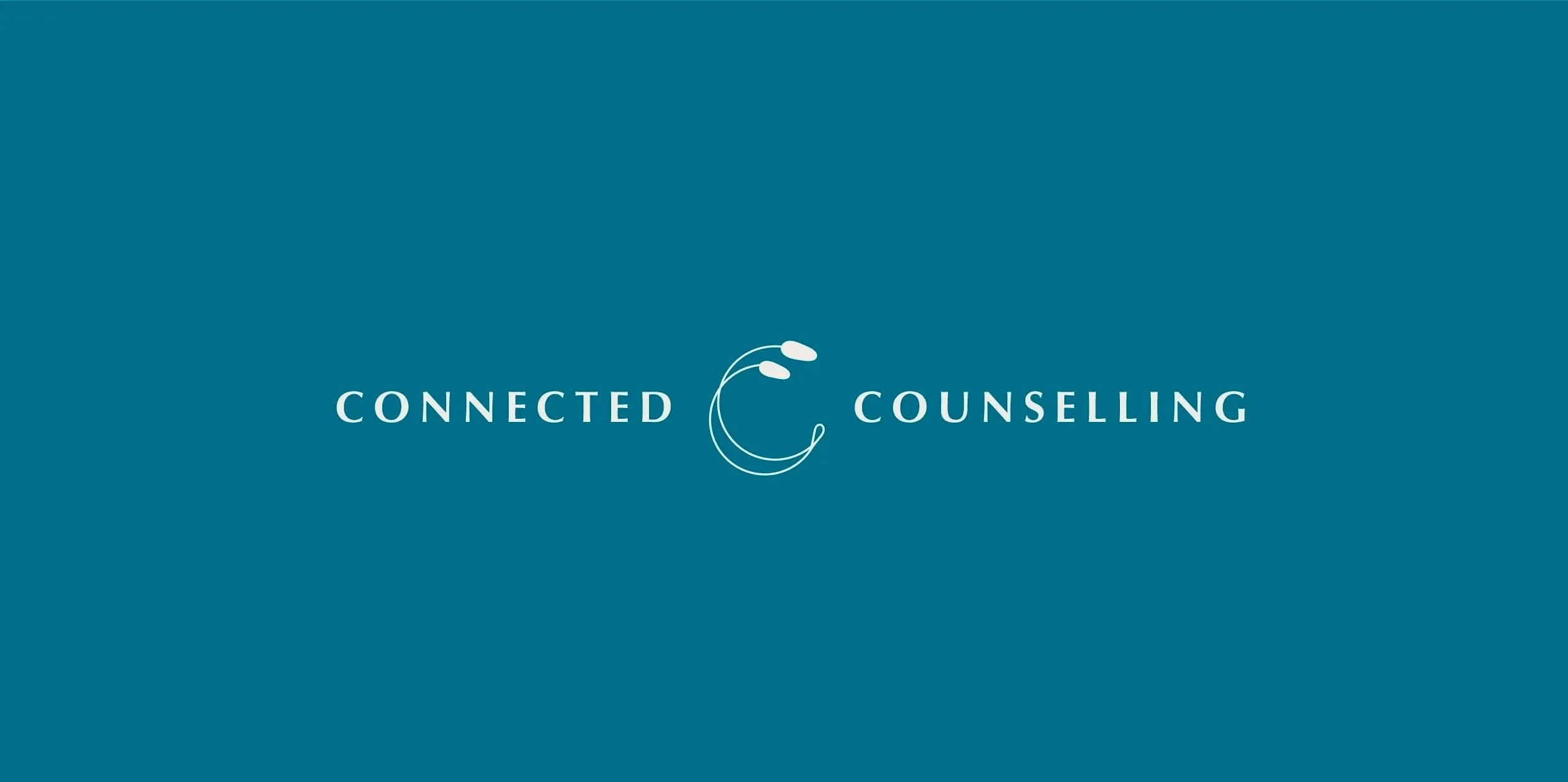
CONNECTED COUNSELLING
A brand identity designed to reflect connection, compassion, and calm. For Connected Counselling, we created a visual identity that communicates trust and balance, using soothing turquoise tones to evoke a sense of serenity and approachability.
The brand combines thoughtful typography and a cohesive colour palette to create a professional yet welcoming presence. Every element was designed to reflect the care and connection at the heart of the counselling services, ensuring clients feel supported and reassured from the very first interaction.
PROJECT SCOPE
-
Logo and brandmark design
Colour palette featuring calm turquoise tones
Typography selection for approachable professionalism
Business card
Brand guidelines for consistency across digital and print touchpoints